I’ve been working on the Positive Peers app since 2015—mostly as a developer at Blackbird Digital until 2023—but after moving on I’ve continued to maintain the app and server as well as developing new features as a consultant.
The original 2015 app (v1.x) was built with the Titanium SDK (originally by Appcelerator, then Axway, now a nonprofit called TiDev) and by 2022 we were feeling the weight of a lot of technical debt when attempting to add new features. I had at that point fully transitioned Blackbird’s other app development work to React Native and had found a lot of benefits to its functional, compositional approach, and so we did something a little crazy: we pitched a complete rebuild of the app.
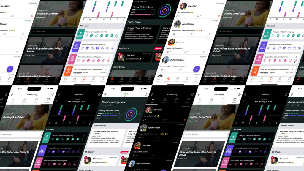
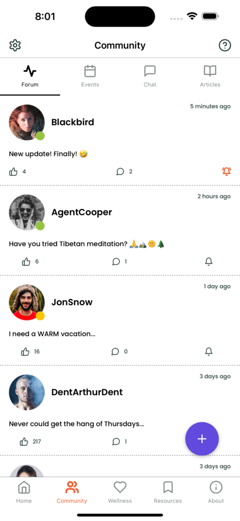
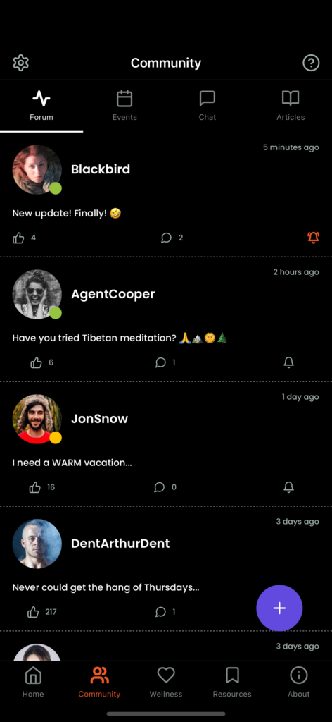
We went through a planning phase with wireframes and tested some of our ideas about reorganization of the UI with real users, and then did a design phase, all of which took about 4-5 months. We were hoping to deploy a working version 2 of the app after another 6 months, but that eventually turned into a little over a year of development. Keep in mind, this was not full-time development for a year—there were lots of other projects and clients vying for my attention, and with only a single app developer I think we did well releasing a fully-featured social app with user forums, private DMs, profiles, an event calendar, local resource databases, badges, push notifications, medication reminders, dark mode, gated public access to blogs, WordPress integration, and new server API endpoints… in about a year.
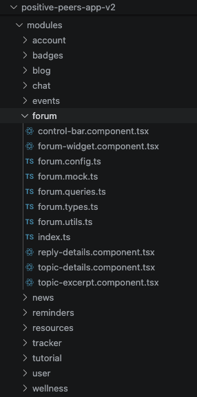
I took some time at the beginning of development just working out a modular code structure using a modified feature-folder approach, hopefully ending up with what some might call “Screaming Architecture”. This is the idea that looking at a codebase should tell you what it does before you’ve even run the program, and I’ve interpreted that to also mean that the folder structure itself should be indicative of the domain function the code inside performs, and not just a description of the framework or design pattern in use (i.e. “models”, “views”, “controllers”, etc).
In this project, I allowed myself one limited set of top-level folders to organize code into:
modules: In here are our domain feature-folders for things likeaccount,chat,reminders, etc.components: These are for “atomic” UI elements that modules and screens use to build the interface, such asavatar,button, and eventext.app: This is similar tomodules, but the modules within are part of the top-level app structure that don’t necessarily involve domain features, such asauth,screens,theme, etc.
I elected not to use an existing UI component framework—if I had done so, I likely would have needed to wrap everything anyways to not have to repeat every color and border radius each time a component was used. I even wrapped React Native components like View and Text into purpose-built components, and then use those custom components throughout all modules and screens. Having full control over your UI components when working from a custom design is critical to the maintainability of an app. Composition is your friend.
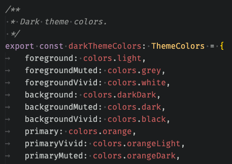
I also elected to build my own theme color system to handle light and dark themes, and also leave room for additional themes in the future. Since we were working with an existing brand color palette, the designer (Jack Watson) created an extended palette with light and dark versions of each main color to be used in different contexts for optimal accessibility. I took that palette and systematized it, abstracting the language of “light” and “dark” into “vivid” and “muted”, so that when switching themes from light to dark I’d still be using the same primaryVivid color variable. I highly recommend coming up with your own theme color system that works within your brand guidelines instead of relying on more generic color theme systems.
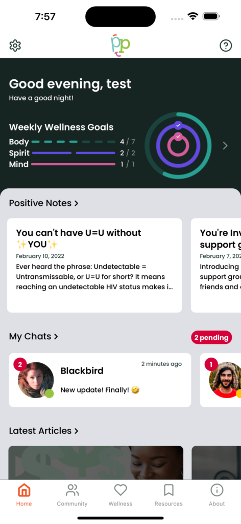
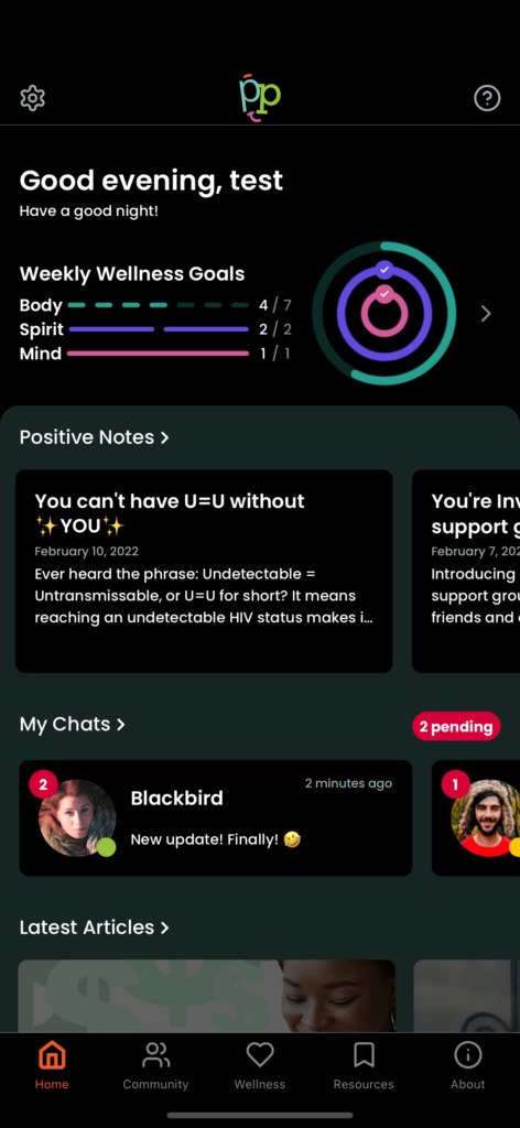
With full control over all basic components used within the app combined with a custom theme system, it was a cinch to handle theme switching via Context. The other cool thing you can do is nest context providers when, for instance, you always want a certain part of the UI to be in “dark mode”, like the home page header above or things like a card with a darkened background image like we use for blog post excerpts.
For code structure within modules/components, I’ve taken some inspiration from Josh Comeau’s Delightful React File/Directory Structure article, with some modifications. Every module is a folder, and every module folder has an index.ts file that exports the public interface of the module. Within the folder is various files that are explicitly named so that you can find what you need at a glance. If it’s the primary component, of the foo module, the file is named foo.component.tsx. Shared types are in foo.types.ts. Miscellaneous constants are in foo.config.ts. File for tanstack/react-query keys and custom hooks: foo.queries.ts. You get the gist. It’s less important that everyone knows exactly what to name the files and more important that concerns are logically separated so that you can find what you need quickly.
Josh does not use a suffix for component files, but I like the explicit label. I also do not capitalize filenames—I subscribe to the idea that capitalized letters in filenames can lead to trouble, particularly with git and filesystems that are either case-sensitive or case-insensitive. Instead, I treat these folders like NPM modules and import them similarly with the help of babel.config and tsconfig.json:
import { Card } from '~/components/card';All of this organization prepwork lead to a desirable outcome in the long run: as new features are requested, new modules are added that encapsulate their purpose and functionality. It also helps when multiple developers are working on different feature branches simultaneously: there’s less likely to be merge conflicts between different features if code for a specific purpose is well-encapsulated.
At this point I’m now realizing that I could have spun this case study out into multiple blog posts about React Native project structure, UI components, and theming. Maybe I’ll do that down the road, but for now, check out the app on the app stores below.
Get the app: