RTG.fish, also known as Rainbow Tomatoes Garden, is an online tinned fish store run by Dan Waber and a small, dedicated team. Yes, they used to sell tomatoes, but found their calling in cans! They are radically good and honest people with a very different approach to business than most, and they are a pleasure to work with.
Background
I was originally put on to the site by an internet acquaintance, then at rainbowtomatoesgarden.com, as the best place to order tinned fish—not just for their selection, but the way they do business.
I was so impressed with the experience that I introduced myself as a WordPress developer, and after several other small projects to help streamline their workflow and tweak the front end, they were gracious enough to let me redesign the whole site.
The site was previously rocking the Twenty Seventeen theme, which is hard to get a screenshot of since the banner image is meant to take up most of the height of the screen, so this is scrolled down significantly:
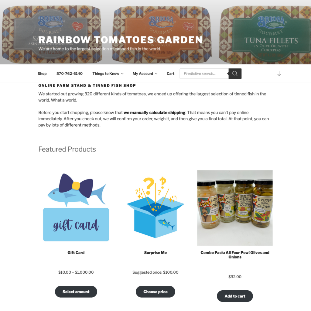
The old theme struggled a bit on mobile and even on desktop, where certain pages within the account dashboard just did not fit well in the narrow content column. It also just wasn’t really designed with e-commerce in mind, and customization was limited.
Block Theme
I could fib and say that I chose to build a block theme (AKA “full site editor theme”) for any number of technical reasons, but the honest truth is that block themes are WordPress now. All new feature development is done in service of blocks and the block editor, and building anything else in 2024 would have been setting the site up for failure.
Design
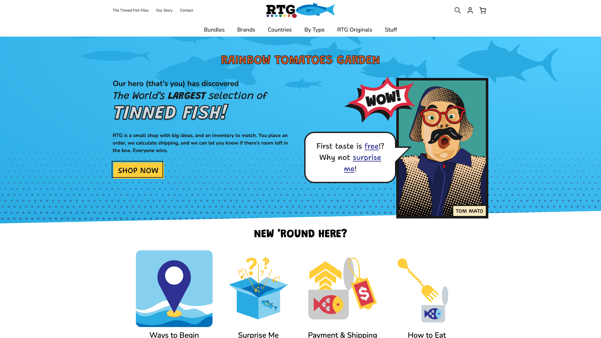
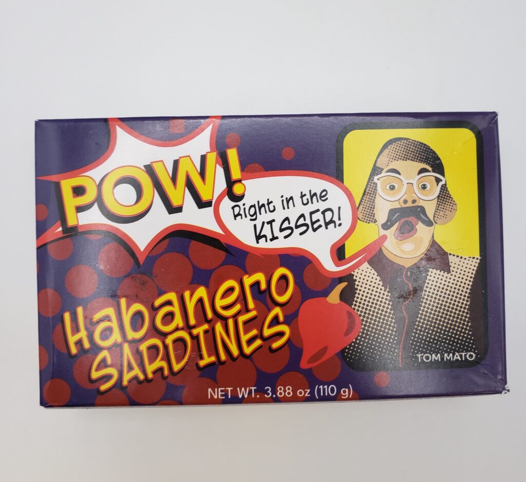
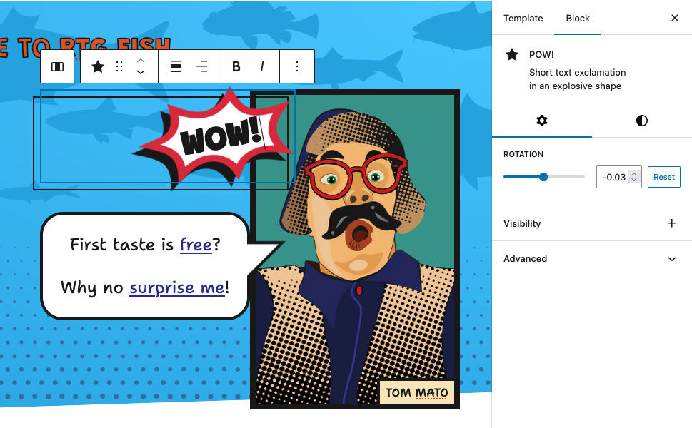
While limited by the old theme design, RTG had been developing their own brand personality in other ways. All of the artwork on the site is original, including an icon for every type of tinned fish they sell. They also created a “Tom Mato” character that does videos and is featured on the branding for their own in-house line of products. Feeling inspired by the comic book brand style, I wanted to bring some of that back into their web presence.
Since they already had comic book styled image assets, I focused on developing other elements of the design: fonts and layout.
Fonts
Fonts used in excess can slow down a site and cause some unpleasantness during initial load, but I know I’d need at least 3 different styles:
- A basic, friendly, highly readable font for body copy
- A bold, attention-grabbing font like the sound-effect text in a comic for headings
- A hand-drawn font to tie in the personal touch and artistry of comics, to be used sparingly
I chose variable fonts for all three to reduce the payload and increase customization, while also being able to easily do fun stuff like this with buttons and links:

Layout
While I had some initial concept designs for more advanced layouts, I toned it down to what you see now to keep the focus on the content and products instead of the design. I chose to keep these elements, primarily for the home page:
1. POW!
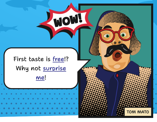
The “POW!” block is custom built with editable color and text that allows for rotation and expands to fit the text, and the rest are core blocks with custom styling applied.
2. Advanced gradients
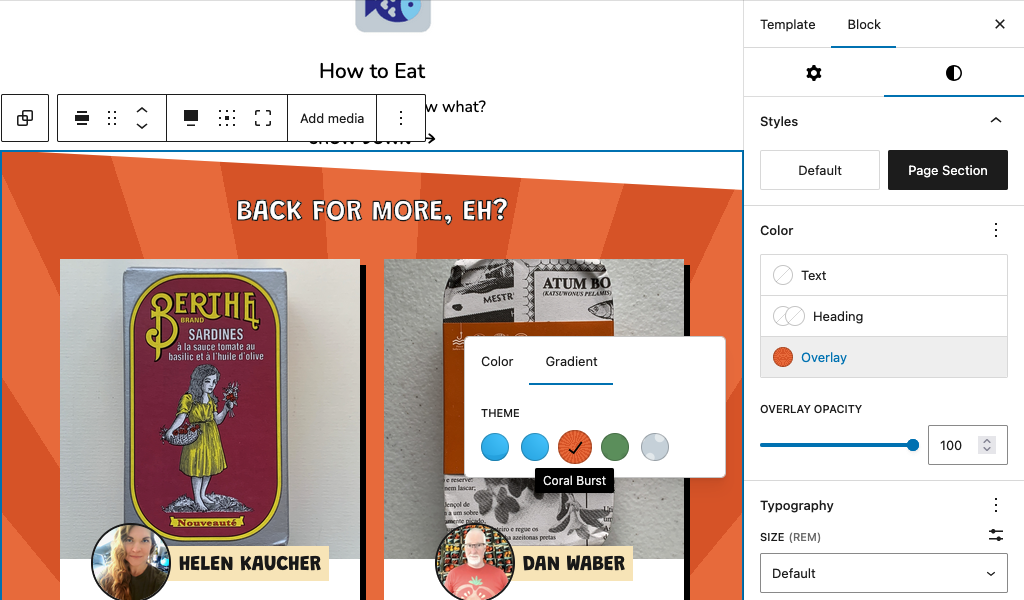
In this theme, I pushed the bounds of what gradient presets can be. I’m sure this will likely be commonplace within a few years, but I realized that custom gradients in theme.json are applied as background-image, so anything compatible with that CSS property is fair game. This is how I realized the halftone patterns and sunburst patterns, which can be applied to any block that supports gradients. Initially I included SVG data URLs directly within these but ran into some LCP issues—I solved this with some workarounds that I might elucidate in a future post.
3. Dynamic angled page sections
Tilted section borders (visible in screenshots above) add some dynamism to the monotony of scrolling the home page. They automatically clip the top and/or bottom if adjacent page sections are detected. These can be customized with the above halftone gradients.
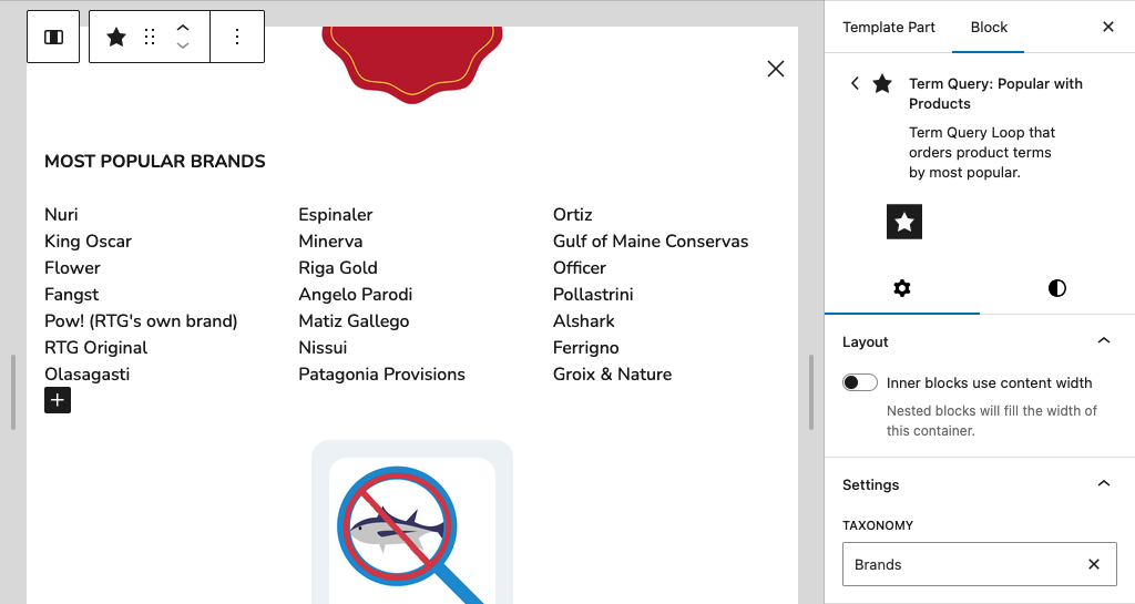
Term Query Loop Plugin
One of the most significant technical challenges was WordPress’s lack of native support for displaying taxonomy terms in flexible, block-based layouts. While WordPress has a powerful Query Loop block for posts, there was no equivalent for taxonomy terms—a critical need for an e-commerce site with complex product categorization.
This gap led me to develop the Term Query Loop Block plugin, which extends the block editor with term-based querying capabilities. For RTG.fish, this was essential for creating dynamic product category lists and the megamenu system.
Popular Product Terms Integration
The RTG.fish term query implementation goes beyond basic term display by integrating analytics-driven popularity sorting. I built a custom dynamic system that calculates taxonomy term popularity by recent sales and caches the results for 24 hours, surfacing the most relevant terms in the megamenu for popular brands, types of fish, countries, etc.